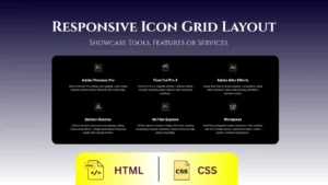


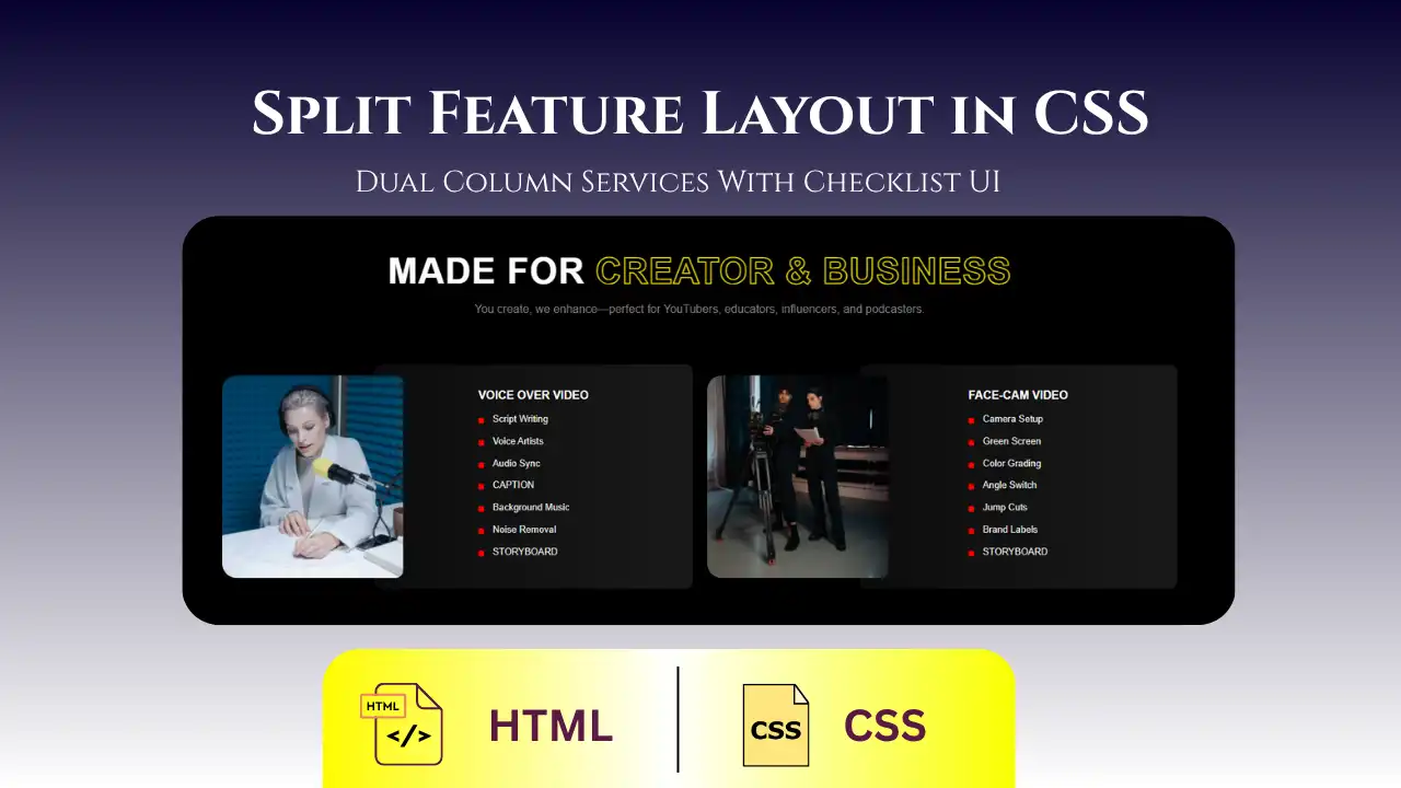
Want to showcase your tools, services, or features in a clean and professional way? This responsive icon grid layout is built with HTML and CSS and works perfectly across all devices. Use it for portfolio sites, SaaS products, company tech stacks, or service sections.
Live Preview
HTML Code
<section class="expert-section">
<p class="expert-label">Editing Software</p>
<h1 class="expert-heading">Our Video Editing Software Expertise</h1>
<p class="expert-intro">
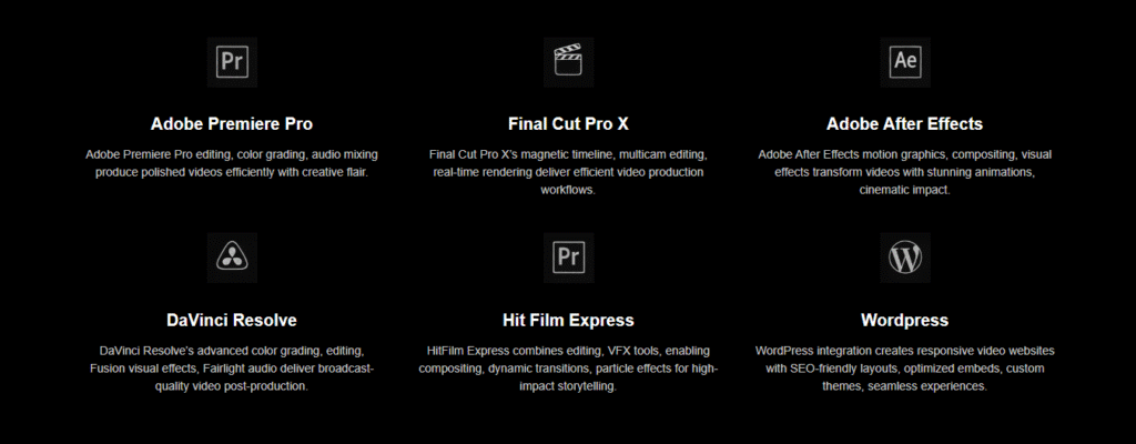
At Acrocampaign, we master industry-leading video editing platforms to deliver exceptional content. <br><br>Our expertise spans Adobe Premiere Pro, Final Cut Pro X, After Effects, DaVinci Resolve, HitFilm Express, and WordPress.
</p>
<div class="expert-grid">
<div class="expert-item">
<img class="expert-icon" src="img/pro2.webp" alt="Adobe Premiere Pro">
<h3 class="expert-title">Adobe Premiere Pro</h3>
<p class="expert-desc">Adobe Premiere Pro editing, color grading, audio mixing produce polished videos efficiently with creative flair.</p>
</div>
<div class="expert-item">
<img class="expert-icon" src="img/finalcutpro.webp" alt="Final Cut Pro X">
<h3 class="expert-title">Final Cut Pro X</h3>
<p class="expert-desc">Final Cut Pro X’s magnetic timeline, multicam editing, real-time rendering deliver efficient video production workflows.</p>
</div>
<div class="expert-item">
<img class="expert-icon" src="img/after.webp" alt="Adobe After Effects">
<h3 class="expert-title">Adobe After Effects</h3>
<p class="expert-desc">Adobe After Effects motion graphics, compositing, visual effects transform videos with stunning animations, cinematic impact.</p>
</div>
<div class="expert-item">
<img class="expert-icon" src="img/davinci.webp" alt="DaVinci Resolve">
<h3 class="expert-title">DaVinci Resolve</h3>
<p class="expert-desc">DaVinci Resolve’s advanced color grading, editing, Fusion visual effects, Fairlight audio deliver broadcast-quality video post-production.</p>
</div>
<div class="expert-item">
<img class="expert-icon" src="img/pro2.webp" alt="HitFilm Express">
<h3 class="expert-title">Hit Film Express</h3>
<p class="expert-desc">HitFilm Express combines editing, VFX tools, enabling compositing, dynamic transitions, particle effects for high-impact storytelling.</p>
</div>
<div class="expert-item">
<img class="expert-icon" src="img/wordpress.webp" alt="OpenShot">
<h3 class="expert-title">WordPress</h3>
<p class="expert-desc">WordPress integration creates responsive video websites with SEO-friendly layouts, optimized embeds, custom themes, seamless experiences.</p>
</div>
</div>
</section>CSS Code
  <style>
    body {
      margin: 0;
      padding: 0;
      background-color: black;
      color: #fff;
      font-family: Arial, sans-serif;
    }
    .expert-section {
      max-width: 1200px;
      margin: 0 auto;
      padding: 0px 20px;
    }
    .expert-label {
      font-size: 14px;
      text-transform: uppercase;
      color: #aaa;
      margin: 0 0 10px;
      letter-spacing: 1px;
    }
    .expert-heading {
      font-size: 36px;
      line-height: 1.2;
      margin: 0 0 20px;
    }
    .expert-intro {
      font-size: 16px;
      color: #ccc;
      margin: 0 0 50px;
      max-width: 800px;
      line-height: 1.5;
    }
    .expert-grid {
      display: grid;
      grid-template-columns: repeat(auto-fit, minmax(280px, 1fr));
      gap: 40px;
    }
    .expert-item {
      text-align: center;
    }
    .expert-icon {
      width: 60px;
      height: auto;
      margin-bottom: 20px;

    }
    .expert-title {
      font-size: 20px;
      margin: 0 0 10px;
    }
    .expert-desc {
      font-size: 14px;
      color: #ccc;
      margin: 0;
      line-height: 1.5;
    }
  </style>
Features of This Design
- Clean and minimalistic layout
- Responsive across devices
- Dark mode friendly
- Easy to customize: just replace icons and text
Where to Use This Design
- Tech stacks on portfolio or resume websites
- Feature grids for SaaS or products
- Tools or services offered by a company
- Team skills section
Customization Tips
- Replace icons with SVGs, PNGs, or font icons
- Add animations or hover effects
- Switch dark theme to light by adjusting background/colors
This icon grid layout is a powerful, reusable CSS component for showcasing any type of grouped content — be it services, tools, technologies, or skills. It’s responsive, stylish, and very easy to integrate into any website.

Ishaan is a passionate programmer with a knack for simplifying complex ideas. With expertise in Python and PHP, he enjoys creating small projects that help others learn and apply coding skills practically. Through his articles, Ishaan aims to inspire and educate budding developers.