

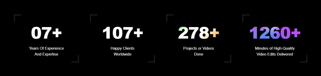
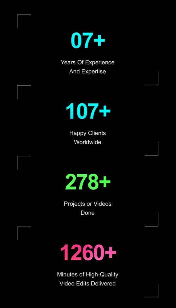
Want to present your stats or milestones with style? Here’s a CSS-only design that uses animated aurora effects to draw attention to key numbers like years of experience, happy clients, and projects completed.
Preview
<div class="info_card_div">
<div class="content">
  <h1 class="title">07+
    <div class="aurora">
      <div class="aurora__item"></div>
      <div class="aurora__item"></div>
      <div class="aurora__item"></div>
      <div class="aurora__item"></div>
    </div>
  </h1>
  <p class="subtitle">Years Of Experience <br>And Expertise</p>
</div>

<div class="content">
  <h1 class="title">107+
    <div class="aurora aurora-one">
      <div class="aurora__item"></div>
      <div class="aurora__item"></div>
      <div class="aurora__item"></div>
      <div class="aurora__item"></div>
    </div>
  </h1>
  <p class="subtitle">Happy Clients <br>Worldwide</p>
</div>

<div class="content">
  <h1 class="title">278+
    <div class="aurora aurora-two">
      <div class="aurora__item"></div>
      <div class="aurora__item"></div>
      <div class="aurora__item"></div>
      <div class="aurora__item"></div>
    </div>
  </h1>
  <p class="subtitle">Projects or Videos <br>Done</p>
</div>

<div class="content">
  <h1 class="title">1260+
    <div class="aurora aurora-three">
      <div class="aurora__item"></div>
      <div class="aurora__item"></div>
      <div class="aurora__item"></div>
      <div class="aurora__item"></div>
    </div>
  </h1>
  <p class="subtitle">Minutes of High-Quality <br>Video Edits Delivered</p>
</div>

</div>
Full CSS Code
<style>

    @import url("https://fonts.googleapis.com/css2?family=Inter:wght@400;800&display=swap");

:root {
  --bg: #000000;
  --clr-1: #00c2ff;
  --clr-2: #33ff8c;
  --clr-3: #ffc640;
  --clr-4: #e54cff;

  --blur: 1rem;
  --fs: clamp(3rem, 5vw, 7rem);
  --ls: clamp(-1.75px, -0.25vw, -3.5px);
}


*,
*::before,
*::after {
  font-family: inherit;
  box-sizing: border-box;
}


.info_card_div {
    display: flex;
    gap: 50px;
    justify-content: center;
}

.content {
  position: relative;
  text-align: center;
  margin: 0px 0px;
  padding: 20px;
  border-radius: 10px;
  z-index: 1;
  width: 20%;
}

/* Top-left L */
.content::before {
  content: "";
  position: absolute;
  top: 0;
  left: 0;
  width: 30px;
  height: 30px;
  border-top: 1px solid #777777;
  border-left: 1px solid #777777;
}

/* Bottom-right L */
.content::after {
  content: "";
  position: absolute;
  bottom: 0;
  right: 0;
  width: 30px;
  height: 30px;
  border-bottom: 1px solid #777777;
  border-right: 1px solid #777777;
}


.title {
  font-size: var(--fs);
  font-weight: 800;
  letter-spacing: var(--ls);
  position: relative;
  overflow: hidden;
  background: #000000;
  margin: 0;
}

.subtitle {
}

.aurora {
  position: absolute;
  top: 0;
  left: 0;
  width: 100%;
  height: 100%;
  z-index: 2;
  mix-blend-mode: darken;
  pointer-events: none;
}

.aurora__item {
  overflow: hidden;
  position: absolute;
  width: 60vw;
  height: 60vw;
  background-color: var(--clr-1);
  border-radius: 37% 29% 27% 27% / 28% 25% 41% 37%;
  filter: blur(var(--blur));
  mix-blend-mode: overlay;
}

.aurora__item:nth-of-type(1) {
  top: -50%;
  animation: aurora-border 6s ease-in-out infinite,
    aurora-1 12s ease-in-out infinite alternate;
}

.aurora__item:nth-of-type(2) {
  background-color: var(--clr-3);
  right: 0;
  top: 0;
  animation: aurora-border 3s ease-in-out infinite,
    aurora-2 6s ease-in-out infinite alternate;
}

.aurora__item:nth-of-type(3) {
  background-color: var(--clr-2);
  left: 0;
  bottom: 0;
  animation: aurora-border 6s ease-in-out infinite,
    aurora-3 8s ease-in-out infinite alternate;
}

.aurora__item:nth-of-type(4) {
  background-color: var(--clr-4);
  right: 0;
  bottom: -50%;
  animation: aurora-border 6s ease-in-out infinite,
    aurora-4 24s ease-in-out infinite alternate;
}


/* Aurora One */
.aurora-one .aurora__item:nth-of-type(1) {
  background-color: #00c2ff;
  animation-duration: 6s, 12s;
}

.aurora-one .aurora__item:nth-of-type(2) {
  background-color: #ffc640;
  animation-duration: 5s, 10s;
}

.aurora-one .aurora__item:nth-of-type(3) {
  background-color: #33ff8c;
  animation-duration: 4s, 8s;
}

.aurora-one .aurora__item:nth-of-type(4) {
  background-color: #e54cff;
  animation-duration: 6s, 18s;
}

/* Aurora Two */
.aurora-two .aurora__item:nth-of-type(1) {
  background-color: #ff4d4d;
  animation-duration: 3s, 9s;
}

.aurora-two .aurora__item:nth-of-type(2) {
  background-color: #ffb84d;
  animation-duration: 3.5s, 7s;
}

.aurora-two .aurora__item:nth-of-type(3) {
  background-color: #ffff4d;
  animation-duration: 4s, 10s;
}

.aurora-two .aurora__item:nth-of-type(4) {
  background-color: #4dff4d;
  animation-duration: 5s, 12s;
}

/* Aurora Three */
.aurora-three .aurora__item:nth-of-type(1) {
  background-color: #4d94ff;
  animation-duration: 5s, 14s;
}

.aurora-three .aurora__item:nth-of-type(2) {
  background-color: #b84dff;
  animation-duration: 4s, 8s;
}

.aurora-three .aurora__item:nth-of-type(3) {
  background-color: #ff4da6;
  animation-duration: 6s, 11s;
}

.aurora-three .aurora__item:nth-of-type(4) {
  background-color: #ff4d4d;
  animation-duration: 5s, 9s;
}


@keyframes aurora-1 {
  0% {
    top: 0;
    right: 0;
  }

  50% {
    top: 100%;
    right: 75%;
  }

  75% {
    top: 100%;
    right: 25%;
  }

  100% {
    top: 0;
    right: 0;
  }
}

@keyframes aurora-2 {
  0% {
    top: -50%;
    left: 0%;
  }

  60% {
    top: 100%;
    left: 75%;
  }

  85% {
    top: 100%;
    left: 25%;
  }

  100% {
    top: -50%;
    left: 0%;
  }
}

@keyframes aurora-3 {
  0% {
    bottom: 0;
    left: 0;
  }

  40% {
    bottom: 100%;
    left: 75%;
  }

  65% {
    bottom: 40%;
    left: 50%;
  }

  100% {
    bottom: 0;
    left: 0;
  }
}

@keyframes aurora-4 {
  0% {
    bottom: -50%;
    right: 0;
  }

  50% {
    bottom: 0%;
    right: 40%;
  }

  90% {
    bottom: 50%;
    right: 25%;
  }

  100% {
    bottom: -50%;
    right: 0;
  }
}

@keyframes aurora-border {
  0% {
    border-radius: 37% 29% 27% 27% / 28% 25% 41% 37%;
  }

  25% {
    border-radius: 47% 29% 39% 49% / 61% 19% 66% 26%;
  }

  50% {
    border-radius: 57% 23% 47% 72% / 63% 17% 66% 33%;
  }

  75% {
    border-radius: 28% 49% 29% 100% / 93% 20% 64% 25%;
  }

  100% {
    border-radius: 37% 29% 27% 27% / 28% 25% 41% 37%;
  }
}

 @media (max-width: 600px) {

     .info_card_div {
     gap: 0px;
    flex-direction: column;
    align-items: center;
     }

     .content {
         width: 80%;
     }
 }

</style>
Ishaan is a passionate programmer with a knack for simplifying complex ideas. With expertise in Python and PHP, he enjoys creating small projects that help others learn and apply coding skills practically. Through his articles, Ishaan aims to inspire and educate budding developers.